Packaging Design
Client Works | Branding | Packaging Design
Designing packaging that’s not only visually striking, but also communicates brand values and enhances the customer experience.
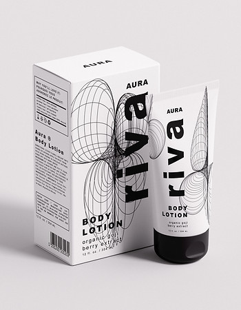
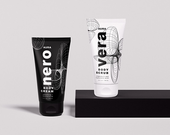
AURA BODY CREAM COLLECTION
The Aura brand's body care line encapsulates a sense of elegance, purity, and tranquility, expressed through minimalist and sophisticated packaging. The design aims to create a strong visual identity that resonates with the emotions and experiences each product name evokes.
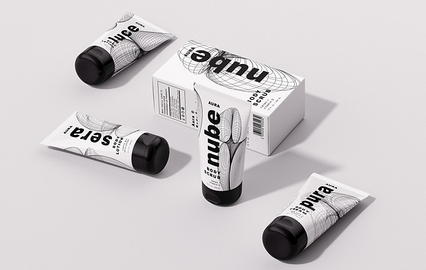
The brand name "Aura" signifies an ethereal presence, suggesting an atmosphere. The packaging design reflects this concept through the use of clean lines, minimalistic typography, and a monochromatic color scheme that feels both modern and timeless.
The primary use of black and white enhances the brand's sophisticated and elegant appeal while the bold and modern typography used for the product names ensures strong brand recognition. The typography is not only readable but also visually striking, aligning with the minimalist aesthetic of the packaging.
The flowing, interconnected lines represent the fluidity and softness of the body care products. These abstract forms were created to represent the skin's collagen being plumped and strengthened through the use of Aura products.
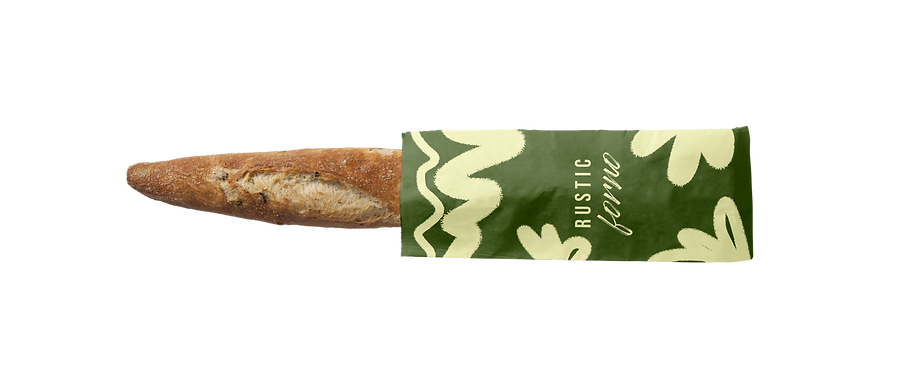
RUSTIC FORNO
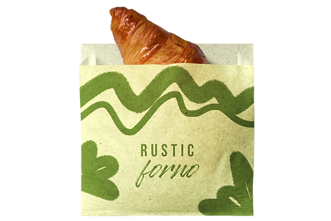
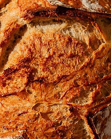
Rustic Forno is an artisanal bakery specializing in handcrafted bread and pastries, where simplicity meets quality. This branding project was built around a warm, organic visual identity designed to evoke the authenticity of the products and the comforting aroma of freshly baked goods.
The color palette, featuring tones of green and cream, reflects nature and the honest flavors of tradition. Hand-drawn patterns with soft, spontaneous shapes convey a sense of craftsmanship and warmth, while the logo combines a bold typeface with expressive lettering—symbolizing the harmony between structure and creativity in the baking process.
The packaging system was designed to suit a variety of products, from baguettes to croissants, ensuring both visual consistency and practical use. Every element—from the paper texture to the graphic design—was crafted to highlight the product without overshadowing it, creating a simple yet refined customer experience.


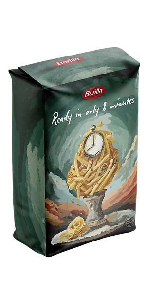
BARILLA - AN ARTISANAL STYLE
Italia: the homeland of art and high-quality cuisine.
This visual exploration project was developed to elevate Barilla’s product narrative through a fully hand-crafted illustration language. The goal was to highlight the artisanal nature of pasta and its deep connection to Italian tradition, transforming the packaging into a storytelling object rather than a purely functional container.
The illustrations reinterpret iconic Barilla elements through an artistic lens: a graphic representation of cooking time translated into art and a painterly composition blending pasta with time-related symbolism, evoking care, anticipation, and authenticity.
The overall concept focuses on perceived quality, handcrafted execution, and sensory impact, reinforcing the idea that pasta is not just a product, but a cultural gesture.